In an effort to bring more sanity to 2016, I’ve been unsubscribing from newsletters like a son-of-a-gun.
I’m an information hoarder, so if I think something has incredible value I’ll give it a whirl (hence the mass exodus from my inbox at the end of every year).
Sometimes, though, I’m so turned off by sucky sign-up forms that I don’t care HOW good the offer seems, I just won’t do it.
I can’t comprehend why I need to give you 56 pieces of information for one ding dang eBook, newsletter, or webinar.
To uncover your sign-up form suckiness factor, I’ve got some examples that show how you might be losing out on conversions with your less-than-stellar opt-in forms.

What Is A Sign-Up Or Opt-In Form?
A sign-up or opt-in form is often located on a website to encourage a passerby to convert from a suspect (someone you don’t know) to a prospect (someone you have marked in your CRM or database).
Ultimately, if your website is one of the ways you obtain leads, you’ll want to have a contact form to capture potential customers and nurture them through your sales pipeline.
Take our simple opt-in form at the end of each blog post: we ask readers get our blog posts delivered to their inbox each week and in exchange for doing so subscribers get a weekly gift delivered to their inbox along with the new post.
We do this to help with audience development and to better understand what types of people are consuming our content.
Are they potential customers? Tire kickers? Competitors? By moving from a suspect to a prospect, we can better understand how and if we can convert these subscribers into sales.
As for creating your own sign-up forms, there are a multitude of sites that can help you (no coding required!):
- MailChimp (for forms and email marketing)
- Drip (for forms and light automation)
- OptinMonster
- Gravity Forms (advanced forms for WordPress sites)
And now … a little ranting. 🙂
What Sucky Sign-Up Forms Look Like
A sucky sign-up form does not follow the KISS rule.
KISS = Keep it simple, stupid.
The lower the barrier to entry, the higher your conversion rate. The key here is simplicity; the harder you make it, the longer the form takes to fill out or if the information requested outweighs the perceived value, your chances of getting sign-ups decreases.
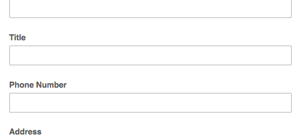
Here’s an example of a not-so-stellar newsletter sign-up form I came across:

Specifically, here’s why this contact form is one that probably doesn’t convert well:
- The last name is probably not necessary
- A company name is probably not essential, and can be asked during a nurture sequence to help get the suspect to first become a prospect
- A title can also be a good way to segment, but is probably doing more harm than good for a simple newsletter sign up
- I don’t know about you, but I often skip opt-ins that ask for my phone number — I don’t want your cold calls!
- Asking for a birthday seems silly (unless this is for a specific birthday nurture campaign, but in this case, we know this form was for a newsletter subscription)
- Giving my address is like giving my phone number, it feels spammy and I don’t need any more junk mail!
- Instead of using language like “subscribe,” try using language like, “sign me up!” so it feels more personalized or actionable
Opt-in forms that ask for fewer items usually have higher conversion rates, but this one asks for 11 items before I can have access to content that I’m not even sure I’ll find valuable.
On this particular site, they had another cardinal sin of not giving enough information on the value of what you’re getting in exchange for your info — they just had a button saying, “sign up for our newsletter!” and this is the form that popped up when clicked.
A similar sucky opt-in form can be seen below:

Again, I’m asked for about 12 to 13 pieces of information, and for what? “Extreme” discounts on training and products? Which training and products?
In fact, looking this over I’m left wondering:
- When does the 12 Days of Christmas event start? When does it end?
- What does “one day discount” mean? Is is a 12-day event or a one-day event?
- Why do you need my zip code twice?
- I just had to throw that little grammatical error in there — it should be, “people who” not “people that” (and trust me, grammar and spelling do make a difference!).
You’ve got to sell your suspects for a chance to put them on your radar. Being vague or not giving enough information is not the way to do that.
Instead, try adding a benefit statement or in the case of the sucky examples above, just give more info!
How Not To Suck (At Sign-Up Forms)
If you’ve read our other posts in the “Ways Your Marketing Sucks” series, you know we’re not keen on telling you how you suck and leaving it at that.
We’re to make you a better marketer. So here are five ways to ensure your contact forms convert:
- Design matters (try one of the tools we listed earlier if you don’t have coding experience)
- Add a benefit statement, pithy stat/social proof, or call-to-action to give users a reason to sign up
- Benefit statement example: Sign up and receive our free best-selling template for sign up forms!
- Pithy stat example: Join 100,00 other subscribers who rely on B Squared Media for tips & tricks on becoming a better social business!
- Entice peeps to sign up not just with copy, but with buttons, arrows, and bold colors
- Benefit statement example: Sign up and receive our free best-selling template for sign up forms!
- Test different places for your opt-ins, some examples:
- Opt-in bars (try Hello Bar)
- Pop-ups
- Feature boxes
- On-post sign ups (like the one here on our blog)
- Sidebar forms
- Opt-in bars (try Hello Bar)
- Short & sweet forms with a lower barrier to entry tend to do best — just look at every single example in this Canva post!
- Test your button color, size, and opt-in copy
- “Subscribe” is boring — try something with action like, “count me in!”
What makes you subscribe? What sticks out as sucky? Let me know about your sign-up form preferences in the comments section below!
Digital & Social Articles on Business 2 Community
(63)