It’s without a doubt that Fairmont’s corporate website could definitely afford a few changes. Let’s take a look at how a corporate website should embody a company’s brand strategy by delving into one of the most iconic hotel chains in the world.
If you’ve ever been to a Fairmont location just about anywhere in the world, you’ll know that it is an incredible experience beyond comparison. From the Banff Springs resort in Alberta to their newest beachside resort in Dubai, this iconic Canadian chain always guarantees a one-of-a-kind historic experience that comes with the highest standards in customer service.
So, why is it that the Fairmont website does not capture this momentous experience online?
The Rundown
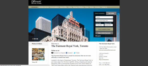
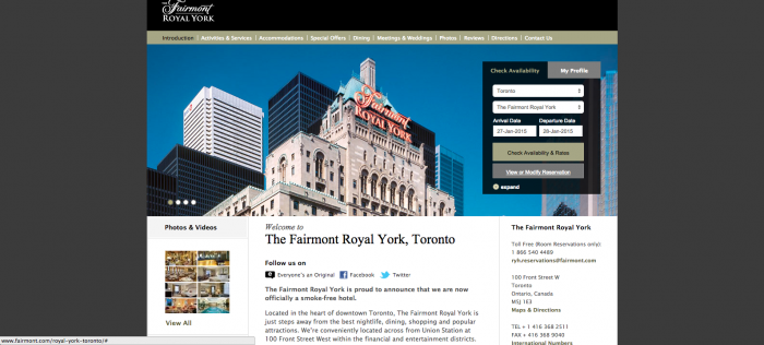
Fairmont is a global corporation with hundreds of unique locations, yet somehow its website squishes every property into a single corporate template. The problem? Your online presence should be a direct reflection of the offline brand activity and personality; None of which are evident on this website. Low resolution stock images, Times New Roman typography and grey borders are all signs that the website has been neglected and left to fend for itself.
The Remedy
There is no quick fix to repairing a dull corporate website, but we most certainly have some pointers worth looking into:
A New CMS – A robust foundation is the first step to a scalable website. In this case, Vordik can 100% recommend implementing a flexible yet powerful content management system such as WordPress VIP, Drupal or Squiz. We’ve already discussed the many benefits of WordPress but, in a nutshell, one of these great CMS options can help maintain consistency and centralized control while giving each location the ability to express a unique personality.
Colours that Pop – It has come to light that vibrant user experiences with bold and clear colour palettes are the most efficient in user engagement. The current colours throughout the site consist of a dull marshy green, a washed out grey and a pale white. By contrast, Fairmont’s corporate colours are a beautiful palette of black, white and gold. As web designers, our minds are afloat with UX inspiration along with some gorgeous ideas that could breath life into the brand online.
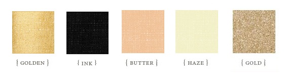
Maybe not this glittery, but the idea is to introduce fresh new colours
A Unique Font – In an age where copy and content rule the internet, typography is one of the most important elements of good web design. Sticking to basics such as Arial, or something gaudy like – God forbid – Comic Sans, is way more noticeable to the untrained eye than it used to be. Trying something new on for size could lead to a font so distinct that it’s recognizably yours. Write any word in one of the three fonts below and we’re willing to bet people will recognize it in a flash.

![]()
A Touch of Lifestyle – The Fairmont Hotel chain has such a loyal following that some travellers will do a full national or even international tour at only Fairmont properties. That kind of brand power can’t possibly go un-leveraged! The opportunity to incorporate fresh lifestyle content such as real Fairmont guest stories is incredible.
A Clear Call to Action – It’s pretty clear by looking at the homepage of the Royal York corporate website what they want you to do- check availability and book in. To be honest, we’ll actually have to give them credit on this one. That being said, there are a variety of UI/UX best practices that are missing. CTA’s should be easy to spot, but shouldn’t distract from the rest of the content. Furthermore, they should naturally blend in with the overall colour scheme and layout. Have a look at Hubspot’s best practice guide and you’ll be able to spot the difference between a strong CTA and a weak one.
The Takeaway
Humans are visual creatures – we like design, we’re blown away by beautiful photography and colours that are easy on the eyes still make a lasting impact. Ironically enough, sometimes simple design is the most difficult to achieve – yet the most powerful to function. Last week we talked about having the right elements to give your users the experience they deserve, and part of that is having a web design that inspires your target audience and compels them to engage. So, take it from us – treat your website like royalty (pun intended), and you’ll soon be reaping the rewards.
(276)