
Making your website user-friendly is extremely important to make sure your customers keep coming back.
When UsabilityTools published the results of a case study that analyzed and tested the websites of 8 universities, it became clear that the people preferred websites with clear menu labels and transparent information.
We have all come across a website or blog that simply does not work, or takes forever to find the right thing, and it is honestly a hassle. This either makes us, consumers, want to quit in frustration or swear we will never come back. The official website for the Basilica of the Sagrada Familia, for example, is not user-friendly at all. That’s one of the greatest reasons for bad reviews this impressive destination gets from tourists.
Making sure your website is user-friendly is not as easy as it sounds; the key is to put yourself in the consumer’s shoes.
A successful user friendly website includes a combination of these elements:
Navigation
Making your website easy to navigate is one of the most important factors that we have to take into account. Knowing where to go to find the exact product that you are looking for is what all consumers love.
- Making a menu or easy to follow links is important. All crucial information should be easily-accessible through the main menu. Consequence of Sound, an influential music blog, is a really user-friendly website because of the effective menu.

- Adding drop down menus will make it even easier for customers to go directly to what they want.
- Don’t make the menu too long. Pixiwoo blog, for example, has a huge Labels menu that takes a lot of space without being actually useful. Since there is a search bar on the site, there is no need for lists of this type.
- Make sure the links and menus work. Broken links cause frustration and ultimately hurt your website.
- If you carry multiple products in different categories, break them into smaller categories so they can be easier to find.
- Make a separate section for promotions. Customers are always looking for the best promotions and setting up a promotion category will be greatly appreciated. Asos, a popular online shopping destination, gets huge attention through promotions and sales. Since most of its customers are looking for these deals, the website clearly provides them in a separate category.

- Your website needs to be accessible across all platforms; cellphones, tablets, computers and even gaming systems.
- Do your best to make the website look similar across all platforms, so the customers will know where to find the product they are looking for.
- A search bar is a must have. These help customers navigate your website faster than clicking through links.
- Make product pictures linked to their description. This is vital, since some consumers may not know the exact name of a product, but if they can click on the picture, the website should redirect them to the specific item.
Design
There are many schools of thought when it comes to the design of a website. Some claim that a simpler color scheme is best to present your products while others say the more dynamic the more attention it will receive.
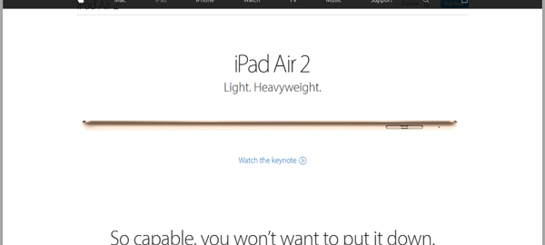
- A simple color scheme is favorable when you want to promote your best item, since it will be your focal point. Apple, for example, is known for its simplistic design that makes your eyes focused on a specific section of the website.

- A more dynamic design is used to promote more than one item. Use this when you want to show off your best items all at once. Asos, which was already mentioned above, is a dynamic website that features several categories and items.
- An easy-to-follow theme should accompany your company’s theme colors. A simple trick that gives the entire website a sense of unity.
- Long paragraphs are not always the best, unless they are needed.
- Adding pictures between the paragraphs or explanations is helpful. This helps the visual learners better understand. The Huffington Post, for example, is a very comprehensive site that proves how important visual content is.

- If you have a special offer or promotion going on, make it your focus point on your homepage. This will help consumers ensure they do not miss out on the great promotion.
- Clumped information will never be good. Try to spread out the information as evenly as possible.
- Color choice is just as important as the way you show your content.
- Try to avoid eye straining colors like neon green or yellow unless you really need to use them.
- Make sure the colors compliment or contrast perfectly like black and white.
- Try the F-Layout that serves the most important information where the eyes of your viewers usually focus. This design was captured using an eye tracking camera that shows that consumers favor an F design. It has been proven to be effective, and most successful websites do have this design in fact.

(Image source)
- Make all the pages equally as attractive. Ensuring that all the pages from the homepage to the products page are visually attractive will show unison of a great design.
- Place contact, about, FAQ’s and other similar links where they are usually found – at the bottom of the page. This is important, since every page online has these links at the bottom.
Audience
Targeting your content to consumers is a great way to make your website more appealing. To do this, first you will have to do some research, like who is buying your product and is there a time when it sells more? Do you want your product to target other age groups?
- Finding out what your consumers love will help you improve the way you showcase your products.
- Target your products. Not all products are meant for everyone; some are age specific, while others are experience specific. Either way make sure your audience is targeted. Levi’s for example, is targeted towards young, fashionable people who want classy, but modern jeans. Although the brand has a broader audience, this is the group its website promotes on the main page.

- Hot items that sell should be the focus point in times when they previously sold the most last year or last month.
- If your plan is working, do not “fix” it. This is a huge mistake many companies do which is trying to better the website when nothing is wrong with it. Consumers like what they know and know what they like. If you change the format of your website, it may be harder for regulars or new customers to find what they are looking for.
- If you do change your theme, keep track of your traffic and sales with this new design and tweak it weekly until you get the best results.
- Your audience will define your theme and color scheme. A younger audience would be attracted to a colorful theme, while an older generation prefers simpler themes.
Overview: How to achieve a whole new level of website usability
Making sure your website is user-friendly is vital to any successful business. It is not the easiest task in the world, but you can make it as easy as it gets if you follow the helpful tips listed above.
For starters, we have to ensure that navigation of your website is easy. The links and menus must be easy to find and follow. Remember: a dead link means frustration. It’s also important to test your website personally, since you will see small details that you may have missed.
Making sure that people can access it across all platforms is also vital since, today people look at websites on a daily basis on portable devices. The website should be as similar as possible to the computer version, since most of the customers look up items primarily on a computer, and then tend to do further research on their smartphones or tablets. Nothing is more frustrating than knowing for a fact that you saw some items at a certain category on your computer, but they do not show up on your tablet.
The next big item in our list is an attractive web design. This really depends on the products your company sells. For companies that have a main product that is the focal point, it is best to have a simpler theme showcasing the product. However, if your company has many items, then a dynamic design that promotes all your items is best.
Color schemes go hand in hand with the design of your website. The easier the words can be seen on your background the better, since the last thing customers want is having a hard time reading the description. One of the most productive web-design strategies is to use a proven pattern called the F-design, which is easier to read and more attractive.
Lastly, we have to make sure that your company is targeting its audience. This is crucially important, since it will be easier to promote your product to potential customers if you know exactly who your audience is. Younger people are into these modern designs with lots of colors and options, whereas an older crowd prefers an easy to use website with fewer distractions.
It is also important to note that if your current website design works, then there is no reason to change it. Unnecessary changes cause hundreds of consumers to become angry, since they were used to this old format that was updated to hopefully improve traffic to the website. Of course, these are just a few examples of ways to make your website more user-friendly with some information from generalassemb.ly and thenextweb. These two great websites have more information and tips on how to improve the user experience with your website.
The last thing to mention is to give your website a try for yourself. Remember that everyone is a consumer at some point in their life; just try to recall the last time you bought something online. What did you like or dislike? Was there anything you wish you could change? Your personal experiences will help you create a user-friendly website from both the vendor’s and consumer’s point of view.
Digital & Social Articles on Business 2 Community(57)