 Wesley Bradley
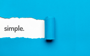
The emphasis put on websites to perform at high-speed is set to have an impact on the web layout trends in 2015. The strict, traditional formula of having a compulsory header, footer, sidebar and content area is being thrown out the window for a sleeker option. Due to the rise in responsive design, there is no fixed formula to web layout and web-designers can afford to be a bit more creative. However, in saying that the trend is definitely heading in a minimalistic direction. The saying that ‘‘the design is complete when all the non-essential elements have been removed” will be the motto for web-designers this year.

To begin the list of trends that are set to de-clutter the web world; chrome is out. The content containment element of a website is an obvious feature and in the past has contained a lot of chrome. The new trend is to remove all that chrome and structure around the website content. Simple matte finishes are considered more stylish in 2015.
You can achieve this simple, matte finish by opting for a flat user interface, a layout that removes all the distracting elements of design. The web-trend of yesteryear was to apply gradients, round corners, shadows and everything that might make the layout as close to reality as it could be. This year it’s all about removing all that jazz; some examples of web giants that have already made the switch are; apple’s iOS 7, Google’s Gmail, Facebook, and Microsoft windows 8.
If at this point you’re thinking, ‘how does the user know what the hierarchy of content is?’ if there is no structure to guide them? It seems the answer is in the typography. Like last year, typography is remaining at the forefront of web design and layout, however its importance is still blooming. Typography, and more specifically the size of the font, is now the indicator of content hierarchy and this year bigger is definitely better. Super large font is trending in web layouts and it’s very efficient at getting the primary message across.
Filling the screen by removing things like scroll bars is being seen more often as the year goes on and it has to be said the result is a much more focussed website. This is because the hierarchy of content needs to be extremely established in order for the user to be able to navigate comfortably around the site. The result is an incredibly streamlined look.
In keeping with the simplistic, streamlined trend, you can expect to see image and colour heavy websites with complex layouts disappearing in favour of those with all the whistles and bells stripped back. The large header with corresponding large background image to match will be replaced with image free headers. By going against the grain, you can, in fact, attract more attention to a header if you choose to have one. Having a very selective and restrained approach to images not only increases the performance of your website but also can have the effect of making the content more easily digestible. Plus minimalistic websites do not date.
But how to stand out in the sea of simplicity?
Spit screens are a savvy technique to maintain simplicity, stand out from the crowd and even get two points across to the user at first glance. It’s a very helpful tool when there are two primary elements of equal importance, such as; women’s and men’s clothing, or perhaps if a company embodies two characteristics equally.
Stock imagery will no longer do in this day and age. There are so many websites now that stock images just don’t cut it anymore. Websites in 2015 will be utilising a more personal and custom-made look with professional and unique images.
In addition to the purpose made images being used in websites today there is an increase in beautiful illustrations. Harking back to the care free days of childhood, sometimes using detailed and humorous illustrations can set users at ease with a website. It also offers a great way to communicate the philosophy of the brand or company the website represents as, unlike with photographs, you can tweak them until they achieve the exact feel required.
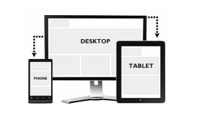
The mobile first approach to web design will start to have its effects on layout as more websites in 2015 will universally be set up more like an app with pop out/fly-out navigational bars. This in turn leads to completely hidden navigational bars that only appear when the user interacts with the website, all just ways to keep the web appearance simple and sleek.

As an offset from the ‘mobile first’ approach, circles are making a come back in web design. As more and more designers are designing for touch screens, circles present the ideal vehicle for a call to action as their round shape corresponds to the buttons of the physical world. Like an elevator button calls to be pressed, so too does a round call to action in a website; they are the perfect shape for a finger on a touch screen. They also provide a point of difference in the web-world where linear rules dominant.
So with speed and efficiency being of the upmost importance for websites these days, it makes sense to remove all the unnecessary, though possibly aesthetically pleasing, bells and whistles. The current opinion is that these non-essentials just act to distract the user from the primary message and slow down the website. In 2015, you’re better off cutting the fat and creating a sleek and modern, no fuss, web layout.
(231)


