At least 2.2 billion people are suffering from visual impairment or blindness. However, with the medical and technological advancements, they have been able to use computers, tablets, and smartphones. Adaptive technologies like screen readers, magnifiers, eye-tracking, joysticks, and sip-and-puff technology have made it even more accessible for the visually challenged individuals to consume digital content.
When it comes to emails, email designers should consider visual impairment while developing the emails. Whether it is the email copy, font size, font color, or visual elements, it should be easily understandable by each and every subscriber.
That said, let’s delve deeper into how to design emails for visually impaired subscribers.
1. Email Copy
Your copy should be divided into easily digestible sections with the help of headings so that your email becomes more readable for all the subscribers including the ones who are accessing your email with the help of a screen reader.
Use Flesch-Kincaid Reading Ease test in Microsoft to know your email’s readability score.
- 90-100: Easily understood by child of 11 years
- 60-70: Easy to understand by 13-15 years old teens
- 30-50: Easy to understand by college students
- 0-30: Understood by college graduates
Simple language will let you have a higher score in the test.
Take a look at this email by Duolingo that scores 69 in the Flesch-Kincaid Reading ease test which is easy to understand by teens aged 13-15 years.
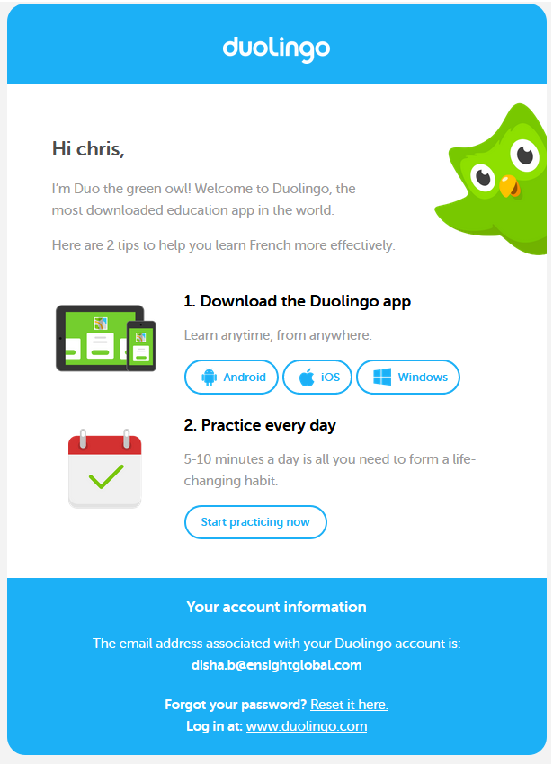
Notice the concise email copy, plenty of white space, and contrasting CTAs.
2. Email Formatting
Have sufficient paragraph spacing to let the email recipient differentiate between two paragraphs. Keep every line of text to 60-70 characters and keep it left aligned. It is recommended to group related content together and separate it with the help of typographic margins and enough white space. Place the most important message at the top to set the right visual hierarchy. This will make sure that the subscribers with neurological or cognitive disability can discern the message properly.
Design your emails such that the content does not get repositioned when CSS is used. Web Accessibility Toolbar or the WAI HTML Table Linearizer are the tools that can help you check the reading order of your email. Make sure the subscriber can easily read it from top to bottom.
3. Usage of Font Typeface
Refrain from using too decorative or light-weight typefaces that your subscriber may find too difficult to read. Use Serif or Sans Serif fonts that render well on every email client and device and are easily accessible for all. Choose the minimum readable font size for your email copy. If the font family has a large x-height, 14px is recommended as the minimum font size while if a font-family has a standard x-height like Arial, 16px should be used. Your line-height should be 1.5 times the size of the font. If your font size is 14px, line-height should be 21px.
4. Colors used in the email
It is important for email marketers to use the right color for subscribers with light sensitivity and migraines. Backlit screens can cause migraines leading to eye strain if they have bright blue and red saturated hues.
Color blindness should be considered as an important condition while designing emails since subscribers are not able to differentiate between some colors. 1 in 12 men and 1 in 200 women in the world suffer from color blindness. Therefore, you should always check your emails with the help of Color BLIndness Simulator. Also, you must use WebAim Color Contrast Checker so that you can understand the color contrast between the text and background color.
See the image below.
(It is a color plate used for Ishihara test for color blindness detection.)
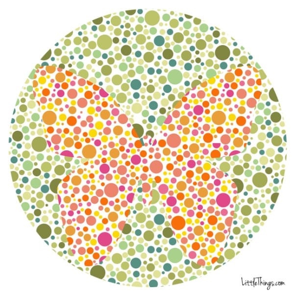
Which animal do you see? A color-blind individual might not be able to perceive that it is a butterfly.
Let’s take a look at few other examples.
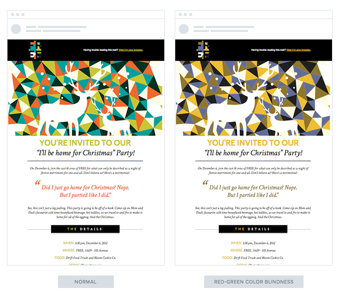
If a red-green color-blind subscriber views the above email, he or she will be able to read the email but not the red color.
Another condition you should take into consideration is deuteranopia.
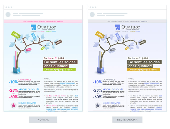
While the copy of the email is easily readable, there is no color contrast. The text written in pink fails to draw attention if the subscriber is deuteranopic. To avoid this, you should be careful while using different colors and backgrounds.
Here are some important points that you should remember when it comes to colors.
- The color should not influence the message you want to convey through the email.
Here’s how a red green color-blind person will perceive red and green buttons. The subscriber could take a decision after reading the choices, but the colors make it a bit complicated.

It would normally look something like this:

2. Ensure good readability by using contrasting colors.
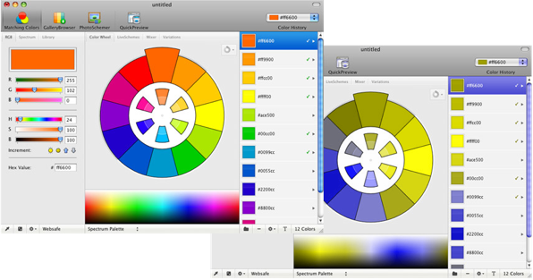
3. Go monochrome by avoiding the usage of too many colors like the example shown below.
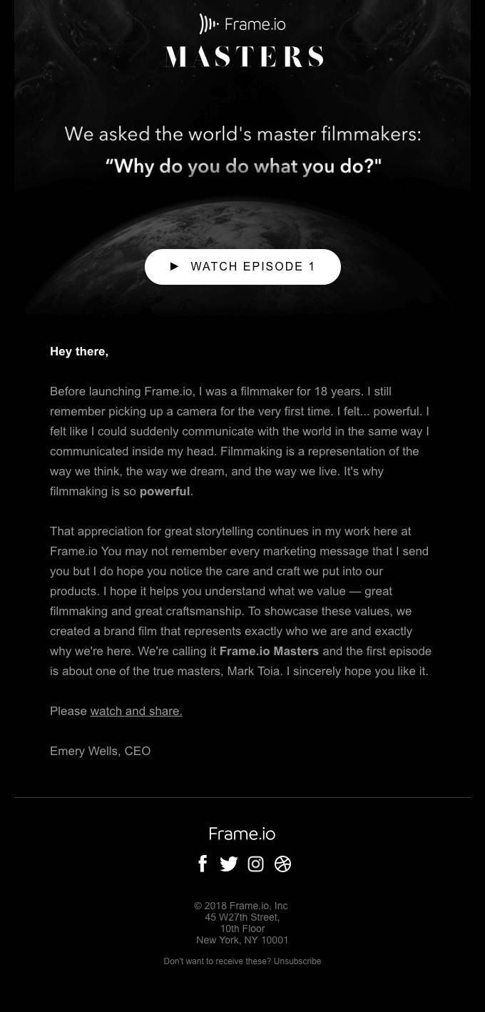
4. Links and text should be of a different color for better understanding of the reader.
5. Color Oracle can be used to check how color blind users will perceive your email.
5. Email Coding
When it comes to creating accessible emails, the most basic requisite is to design a responsive email that renders well irrespective of the size of the screens, device type, and screen reader used. Headlines should be written in <h1> tags while headings in <h2> to <h6> tags. Paragraphs should be wrapped in <p> tags.
For Microsoft Outlook subscribers, mso-line-height-rule:exactly; should be used in the <h> tags to maintain the line-height rule.
To make sure that email and webmail clients do not include any additional line space, use code style=“margin:0;” into the opening tags.
aria-hidden=“true” should be written in spacer elements to instruct the screen readers to ignore the spacers used in the email.
role=“presentation” should be added into every opening <table> tag. It will let the screen readers know that they should not read every cell into the email.
Do not add any unnecessary code that can make the HTML heavy and result in rendering issues.
Include both plain text and HTML versions of the email. The HTML email will allow the user to see the images and the text-only email will display the text, thereby making it easier for the screen readers to read the email.
6. Visual Elements
Visuals should be supported with a suitable alt text to aid the screen readers.
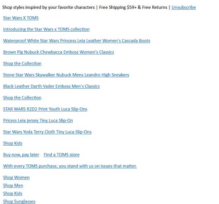
The actual email would look something like this.

By adding Alt text, you let the subscriber know what the email is all about. It will not only help the visually impaired subscriber using screen readers but also a subscriber who has images blocked in the email client by default.
Wrapping Up
If you want your emails to reach a larger audience and make it accessible to everyone, you should surely follow these tips. After all, user-friendly emails can surely enhance your brand credibility and increase the conversion rate.
Digital & Social Articles on Business 2 Community
(93)
