A Quick Guide to Typography
Typography is arguably the most important part of any design because it carries the overall message. It is also important for the digital marketer to understand and communicate the typography goals of the client, and because many clients have no formal training in typography, it could be difficult for them to explain what they are looking for. This is a brief guide to the world of typography, which tries to bridge the gap between client and marketer.
Common Client Phrases
- I want something more… round.
- We are trying for something more traditional.
- The font is too bold.
- I like it, but the font is ugly, do you have something prettier?
- I don’t like the font, try something else.
This guide will help to decode these common client phrases and allow you to make educated decisions about typefaces clients may want.
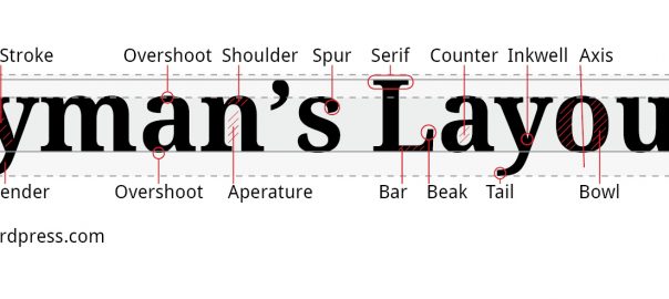
Type Anatomy

Knowing the basics of type anatomy is important in understanding the differences between different styles of typefaces. Every element of each letter has a specific name, but the most important elements to know are:
- X-height
- Cap-height
- Serifs
- Stem
- Ascenders
- Descenders
These elements make up the majority of a typeface and allow for easy differentiation.
Font Weight

Font weight is very important to know, and it is important to pick a typeface with a wide variety of weights. For example, sometimes the client isn’t aware that a particular font can go all the way from ultra-light to extra-bold. Choosing a typeface can give you multiple options to change the look of a typeface to satisfy a client’s needs.
Types of Fonts/Typefaces
There are three main classifications of typefaces:
- Serif
- Sans-serif
- Script
Almost every typeface out there today will fall into one of those categories. However, each one of these styles have numerous subclasses in them.
Serif Classifications
Three main categories of serif are
- Traditional
- Slab
- Didot/didone
Traditional

Traditional serif typefaces have a more humanist look to them and often show the imperfections of the tool they were originally drawn with. The have large, curved serifs and fairly significant contrast in the thick and thins of the strokes.
Slab Serif

Slab serifs are usually very bold typefaces with squared-off serifs. They have far less contrast between the thick and thins of the traditional serifs. Clients are usually accustomed to seeing them on such things as old western signs, and college and sports sweaters.
Didot/Didone Serif

Didot serif typefaces are more elegant and have large contrasts in thick and thin strokes. Their serifs are also long, thin, and often squared off. Clients are accustomed to seeing this style of typeface in such publications as fashion magazines.
Sans-Serif Classifications
There are four main classifications of sans-serif typeface:
- Grotesque
- Geometric
- Square
- Humanist
Grotesque

Grotesque sans-serifs generally have high x-heights and very little contrast between strokes. They are slightly condensed which allows you to fit more letters on a line. They are clean, modern typefaces.
Geometric

Geometric sans-serifs get their name from the geometric shapes that make up their letter forms. The round letters such as ‘o’, ‘e’ and ‘c’ are made up of perfect circles. These are very modern typefaces.
Square

Square sans-serif typefaces get their name from the “squaring” off of the round characters such as ‘o’, ‘e’ and ‘c’. They are usually stronger looking typefaces and work well with futuristic designs.
Humanist
Humanist sans-serifs differ from the previous classifications as they have a fair amount of contrast in their strokes. They take after traditional serifs in the fact that they resemble a more hand-written quality compared to the computer-like elements of other sans-serifs.
Script Classifications
Three main script classifications are:
- Copperplate
- Brush
- Blackletter
Copperplate

Copperplate is a style of calligraphy writing that uses a pointed steel nib or quill to produce a style of lettering characterized by both thick and thin strokes. It is fairly elegant so it is not suited for every project, but when used well it can make a design shine.
Brush

Brush scripts are created by using brush pens which act more like a pointed paintbrush. Because of the nature of the tool they are usually a looser script and have a nostalgic, and humanistic feeling to them.
Blackletter

Blackletter, or Gothic scripts was a script used throughout Western Europe in the 12th century. They are drawn with a broad tipped nib which creates strong contrast between thick and thin strokes.
Common Client Phrases
Let’s look back at those common client phrases and the answers we could now provide:
- “I want something more… round.” – Geometric Sans Serif
- “We are trying for something more traditional.” – Traditional Serif
- The font is too bold.” – Try a different weight
- I like it, but the font is ugly, do you have something prettier?” – Copperplace script
- “I don’t like the font, try something else.” – Slab serif
Simple Type Tips
Try to only use 2 typefaces in any project or document
- Don’t pair two decorative fonts together.
- Headings should have enough contrast (ie. Bigger in size, different weight, both)
- Allow space between headers and paragraphs.
- Never stretch type!!!
(125)