
The human brain is an incredible tool, but it can also be puzzling. For the landing page designer, the human brain presents the greatest challenge as well as the greatest ally.
You might not have thought about how psychology plays into landing page design, but at the root of it, it’s what makes your site convert and your business thrive. Without understanding what persuades us to action, your page is just another page. But, when you use some basic psychological triggers to drive action, you can get great results.
Psychology 101 is what most marketers get a crash course in throughout their educations (both academically and professionally), but if you want to get deeper and more in tune with what compels people to take action, it’s important to explore what makes our brains tick.
Blame the bookworm in me, but I’ve always been a big fan of reading books about the psychology of marketing to boost my practical skills. Titles like Predictably Irrational, Enchantment, Neuromarketing, Why We Buy, and books by Malcolm Gladwell and Robert Cialdini have given countless marketers the tools they need to tap into the workings of the human brain.
Taking a page from their books (as well as other marketing scientists), here are three psychological tools you can use to compel people to take the action you desire most, whether it’s making a purchase, giving you their contact information, making a phone call, or anything in-between.
Social Proof
Over 70% of Americans say they look at product reviews before making a purchase, nearly 63% of consumers say they are more likely to purchase from a site if it has product ratings, and product reviews are 12x more trusted than manufacturer’s product descriptions.
In a study published by the Washington Post, researchers used signs to persuade customers to use less energy in the summer by using fans instead of A/C. The sign that performed best in the study? One that let customers know that 77% of their neighbors were using fans to save energy.
In another study of 10,000 accounts at a German bank, it was revealed that customers who were referred to the bank by other customers had a 16% higher lifetime value than those who came from other sources. Plus, those referred customers churned 18% less.
Bottom line? Social proof works.
Social proof is all about getting people to conform or trust the actions of others, convincing them that those actions are the right thing to do.
When we look at product reviews, search for tweets about a company we want to do business with, or ask for opinions from our friends on whether or not to choose a certain retailer, we are searching for social proof and moreover, the feeling that the choice we’re making is the right one.
We like reassurance. We like to feel secure in the decisions we make. The more you can do to show someone that they are making the right choice, the easier it is to get them to convert.
Sometimes that takes the form of a testimonial or an endorsement by a trusted influencer. Sometimes it’s the star rating associated with a product, service, or business. Other times, it’s the overwhelming buzz on social media that creates a tipping point for someone to say “yes!”.
Square uses social proof in the form of testimonials from real customers. Throughout their landing pages, you’ll see strong graphics with direct quotes on how a feature or benefit of Square made success possible.

Similarly, LeadPages does the same thing, only with the added use of pictures of the endorsers and credentials to show authority.

And on Sears, they display the classic product review stars and the number of reviews throughout their product catalog to entice a click. Once on the product page, the reviews are easily accessible and can be used to persuade the user to take that next step to purchase.

To incorporate social proof into your landing pages, look for opportunities to include the opinions and testimonials of others (and for added points, use pictures). Find ways to show that there’s a community of influencers who trust in what you deliver and can vouch for it. Enable product reviews. Use language that demonstrates a community or majority (e.g. “Join 10,000+ influencers sharing honest reviews”, “Connect with 5,000 fellow Facebook fans”, etc.).
Also, take a peek at this post in Fast Company about different types of social proof and how to incorporate them into your business. It’s a great place to get started.
Scarcity & Urgency
There’s a reason why countdown clocks, inventory numbers, and warnings of “don’t miss this!” work well in landing page design. We have an urge to not want to miss something so the idea of creating a sense of urgency around a conversion can only compel people to take action.
The idea of scarcity is to increase its value to a user by creating the perception that the item is rare or scarce in supply. When we show that we only have a limited quantity, people tend to want that item more than if it were in abundance.
Additionally, urgency is all about giving someone the feeling that whatever is happening, it’s important and you don’t want to miss out on being part of it. It has everything to do with time. (Note: need a quick breakdown on urgency vs. scarcity? Check out this guide on The Daily Egg).
On ModCloth, they use scarcity to motivate purchases of sale items. In addition to displaying a prominent cut price in red, they also show a live countdown of inventory as it gets close to the final pieces.

On The Clymb, a flash sale site, the display a deadline for each sale to encourage people to take action now before they miss out -a classic urgency-creating tactic.

In another example, Peculiar Culinary Company promoted their Kickstarter campaign to raise funds for a food truck through active Facebook updates that blended together both the tactics of urgency (via time updates) and social proof (sharing the number of backers, encouraging engagement, etc.).

You can also think about using color psychology to boost urgency by using “urgent colors”. Red, orange, and yellow can cause someone to feel compelled to take action, as demonstrated by a study conducted by HubSpot where switching to a red CTA button from a green one increased a site’s conversion rate by 21%.

Consider adding a countdown clock or making your offer bound to a specific time if you want to incorporate scarcity into your landing page design. Find a way to signal limited availability or exclusivity (e.g. “Only open to the first 50 registrants!”). Show inventory in a live countdown as you sell out of an item. There are many ways to display scarcity through language choices, too (i.e. use words like “now”, “act fast”, “don’t wait”, etc.)
Reciprocity
When someone gives us something, we’re compelled to give something back in return.
Sometimes that means giving a phone number to get a coupon or making a purchase to get another item at a discount or for free. Other times, it’s giving information in exchange for an answer or guidance in our shopping experience.
Reciprocity is a powerful landing page tool because it can fulfill multiple purposes. In addition to driving conversions, reciprocity can be used for valuable data gathering and customer feedback.
For example, True & Co. designs its shopping experience around personalized recommendations. To get your recommendation, you fill out a short fit quiz to give feedback about your sizing, current bra fit, and other preferences. When you’re finished, you’re presented with a personalized inventory that’s narrowed down to fit your fit criteria using the information from the quiz. 
You get a personalized shopping experience from your lingerie retailer online (no visit to a boutique required!)- and True & Co. gets valuable consumer insight, helping them to design better inventories, better promotions, and more targeted messages.
In a more traditional sense, reciprocity can drive conversions around the promise of providing something in exchange for a bonus or free gift.
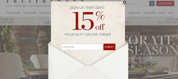
Pottery Barn provides a popup for new users on their homepage. Give your email address and get a coupon to save on your next order. PB gets to build up their email list while you get the benefit of additional savings. It’s a win-win for both.

Use reciprocity on your landing pages by including offers that ask for information but deliver something in return (e.g. sign up for our course and receive a free ebook!). You can also think about designing your landing page to include information-driven reciprocity elements in the same way that True & Co. does with their lingerie fittings.
For example, design a simple experience where people can input or select an option that gives you more information about that lead and then drive them to a next step that makes the most sense for their situation.
Let’s say you’re a marketing consultant and you want to generate new customer leads. Maybe your landing page might look like something where you ask, “What is your Greatest Marketing Challenge?” and from there, you give 3 options – the user selects the one that most closely matches their needs and they’re taken to a personalized section related to that answer with strong calls to action and lead collecting sources (e.g. email sign up). You’ll get insight into where they are in your funnel and what their specific interests are – even before you do your follow up.
There Are More Tactics Out There
While these three tactics are just a few that can be used in landing page design, the most successful conversion optimization experts know that it all really comes down to managing risk.
Either you create a page that communicates the risk of saying “no” (e.g. by using scarcity or urgency) or lowers the feel of risk associated with saying “yes” (e.g. social proof or reciprocity). As for the best way to do those things, well, that’s what’s up to you and it’s what keeps us on our toes! There are always new ways to put these psychological tools into action.
Understand risk and you’ll have the right foundation to start testing your theories on how to drive action, manage hesitation, and persuade people to take the next step.
What psychology-driven landing page tools have you used? Did it work? I’d love to hear more about your experience!
Now Read:
- How To Increase Conversions 120%+ With Less Form Fields
- What Is A Landing Page And How Is It Used?
- How To Use Landing Pages In Google Analytics To Find Keywords
Next Steps:
- How To Increase Conversions 120%+ With Less Form Fields
- What Is A Landing Page And How Is It Used?
- How To Use Landing Pages In Google Analytics To Find Keywords
Hand-Picked Related Articles:
- How To Increase Conversions 120%+ With Less Form Fields
- What Is A Landing Page And How Is It Used?
- How To Use Landing Pages In Google Analytics To Find Keywords
* Lead images adapted from Blue Pylons, Rickydavid
3 Psychological Tools To Use In Landing Page Design
The post 3 Psychological Tools To Use In Landing Page Design appeared first on Search Engine People Blog.
(205)

