— September 9, 2019
One of my first purchases as a communications student was Robin Williams’ The Non-Designer’s Design Book. The title is pretty self-explanatory. Each chapter of the book elaborates on one of four essential design rules Williams selected for easy, clean design: proximity, alignment, repetition, and contrast. Years later, the four rules are still my cornerstone of design.
Writing is of course the pillar of public relations; however, defining ourselves as solely writers, often leads us to shy away from producing our own visual elements that elevate the overall message. Even simple PowerPoint design can be daunting for many.
Following Williams’ four design principles took me from self-proclaimed non-artist, to Adobe Suite aficionado – but you don’t need to drown in Adobe to be a visual communicator. Let’s start by giving everyday slides (or charts and graphics for blogs and social) a facelift with these design principles.
Proximity
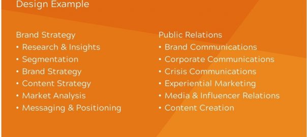
It’s pretty intuitive – placing elements close together implies a relationship. Your eye does not want to dart around the screen to figure out which subtitles goes with which paragraph or find an unrelated image above an unrelated paragraph. Keeping related pieces close together immediately tells the viewer what goes together.
Good:
Bad:
Alignment
Guidelines (think red dashed lines on PowerPoint) appear on most creative applications for a reason. Use them to your advantage! Avoid placing anything on your artboard that isn’t thoughtfully aligned to the other elements. PowerPoint pro tip: Hold the Ctrl key and click two objects, then click Align in the Arrange section of the Shape Format tab. You can perfectly align objects by top, bottom, or center, and evenly distribute multiple objects.
Good:
Bad:
Repetition
Create easy-on-the-eye consistency by establishing a repetitive style. Other than the fact this principle creates a cohesive look, repetition helps create hierarchy. By establishing a steady style for blog titles and subtitles, readers can easily discern what it most important.
Good: 
Bad (try to spot all six inconsistencies): 
Contrast
On the flipside of repetition, contrast distinguishing items on the page helps create categories and visual excitement. We typically think of contrasting colors, but the principle also applies to font, size, angle, and more. Warning: contrasting elements should differentiate from each other, but still match a visual theme.
Good:
Bad:
For your next blog post, try creating a chart that helps illustrate your message. Add text to your next image queued for social media. Williams’ principles can empower you to take chances on clear, personalized visual communication.
Digital & Social Articles on Business 2 Community
(76)